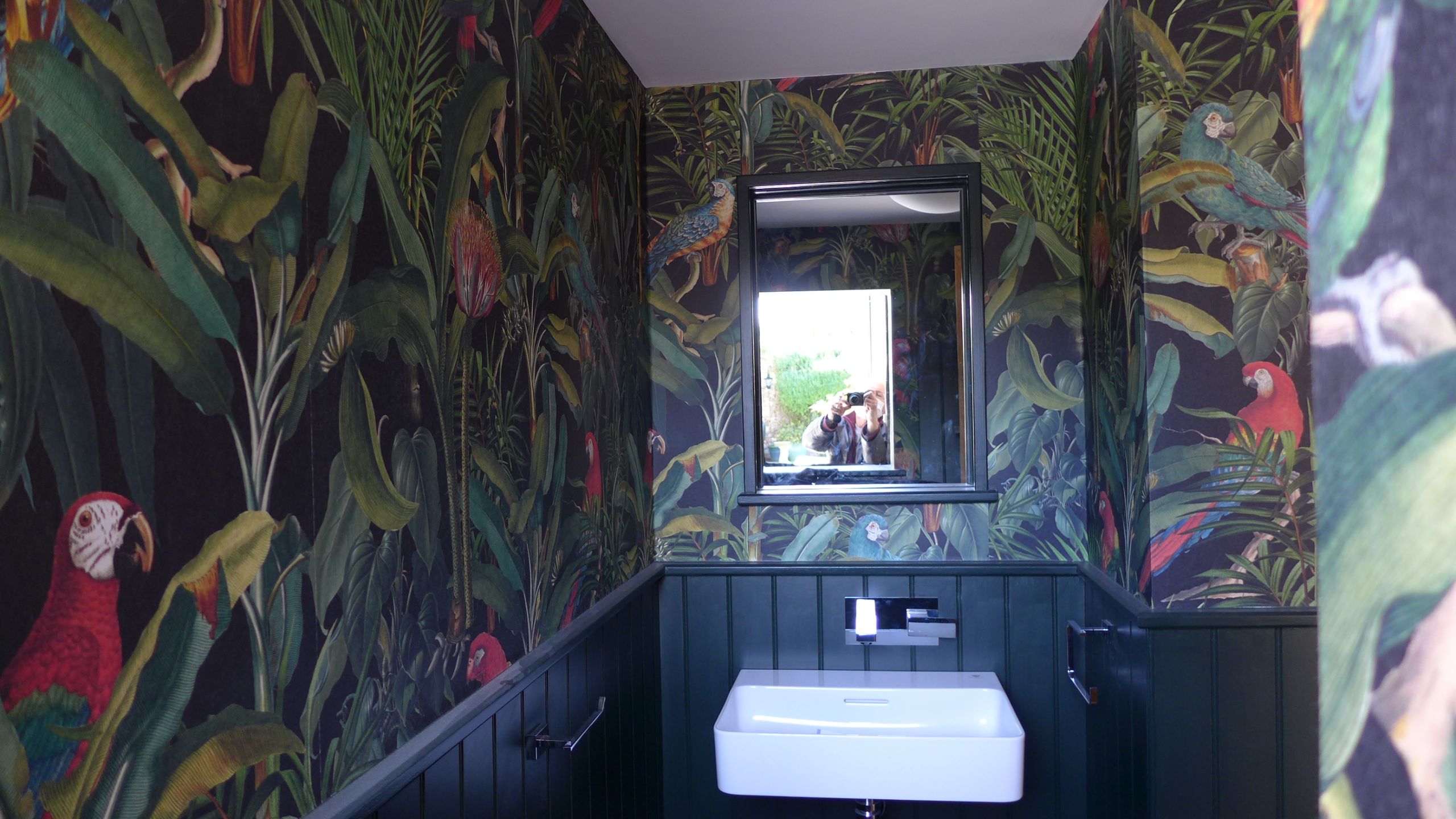
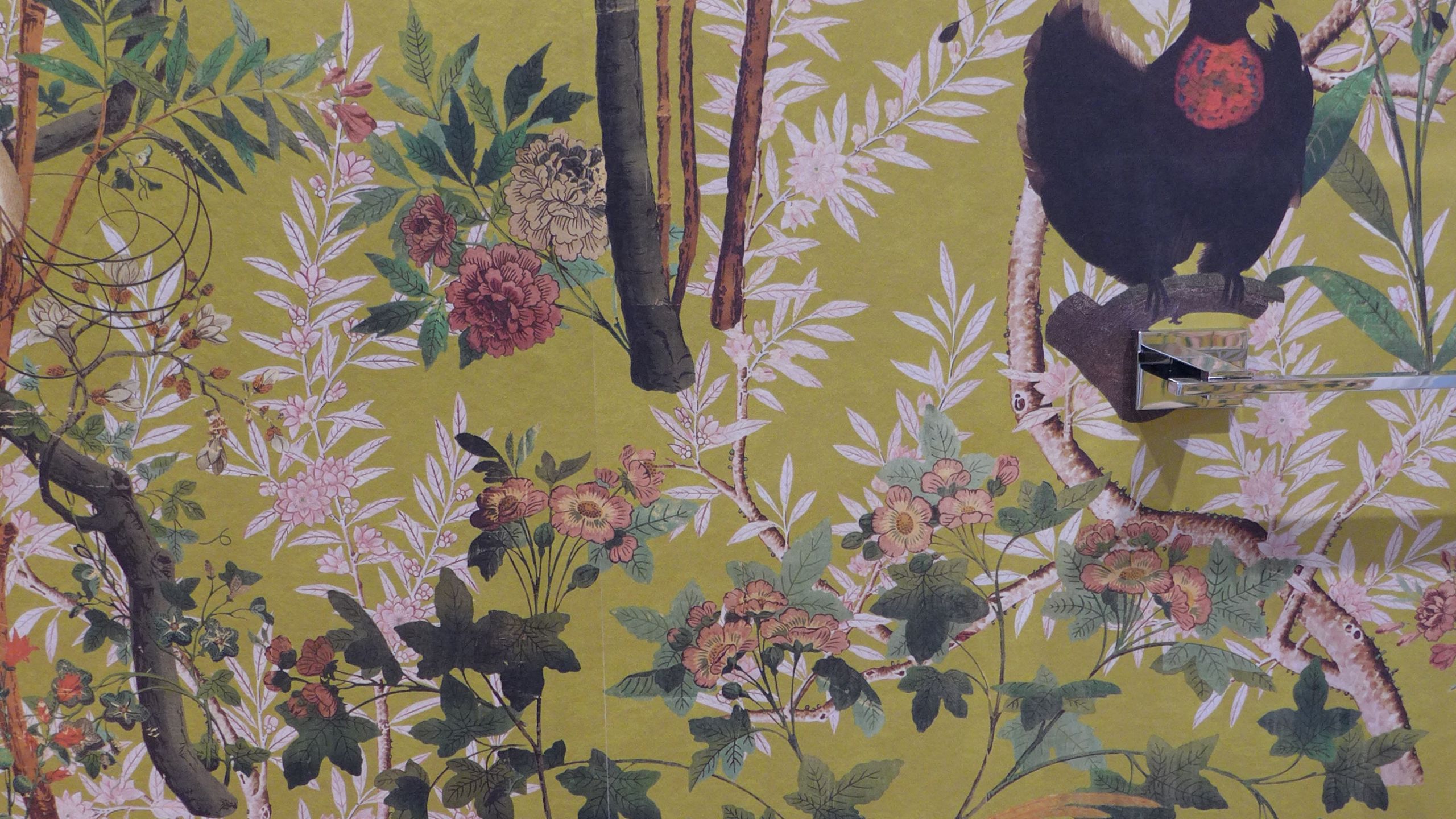

Decoration is a key part of our interior design service. More than just painting the walls and ceilings, our decorative schemes combine finishes with lighting, fabrics, flooring and furniture.


Choosing paint colours
A common mistake of the DIY enthusiast is to choose a paint colour without considering the rest of the space. A second mistake is to choose from a tiny paint sample card. Much safer to select two or three colours that you like then invest in a few match pots. Paint paint several A0 size boards, or the back of wallpaper offcuts and move them around the room and see how they look at different times of the day. It’s worth this extra time and minimal expense to avoid costly mistakes and you can re-use the boards later.
Then you can compare different coloured boards side by side and choose your favourite. If you can’t decide between them, that’s a good sign – you’d be happy with either, so don’t fret.
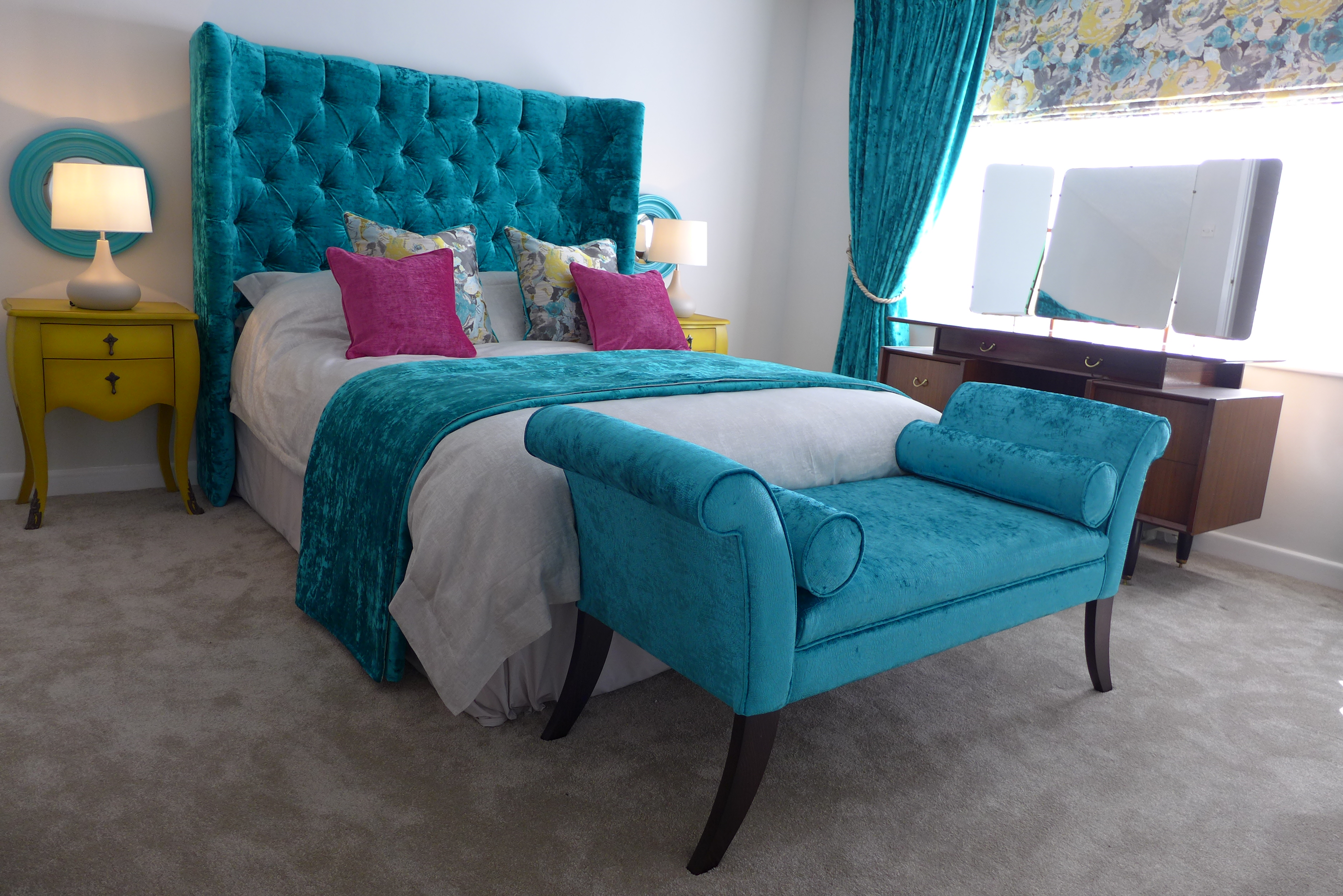
Here is how this mood board translated into a decorative bedroom scheme:

Sample boards
It is amazing how colours change in different lights and on different walls. By using 2 boards of the same colour, you can place them next to each other in a corner – colours tend to take on a deeper tone when reflecting on themselves. A single board against a white wall will look lighter, and not representative of the finished scheme.
Quality paint
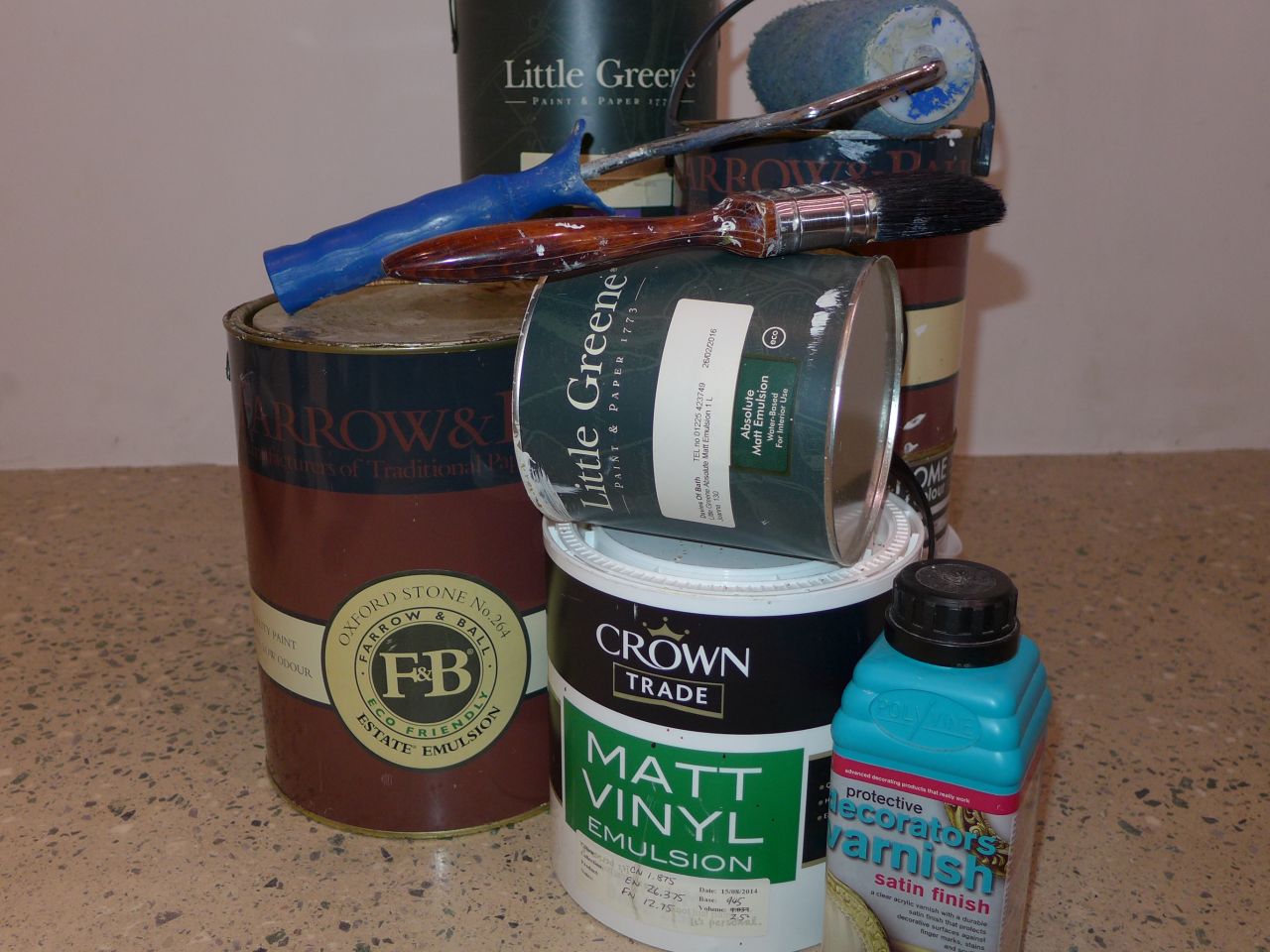
Quality paints are definitely worth the investment both in their coverage and ability to touch up and match later. Paint for a regular British reception room can reach over £150, plus the labour, so choosing wisely first time is clearly cost-efficient.
Most of our designs create a neutral decorative backdrop for accent colours to pop. Pale grey, stone and cream are great for this. You can read our advice on decorating with accent colours.
Tricks with paint
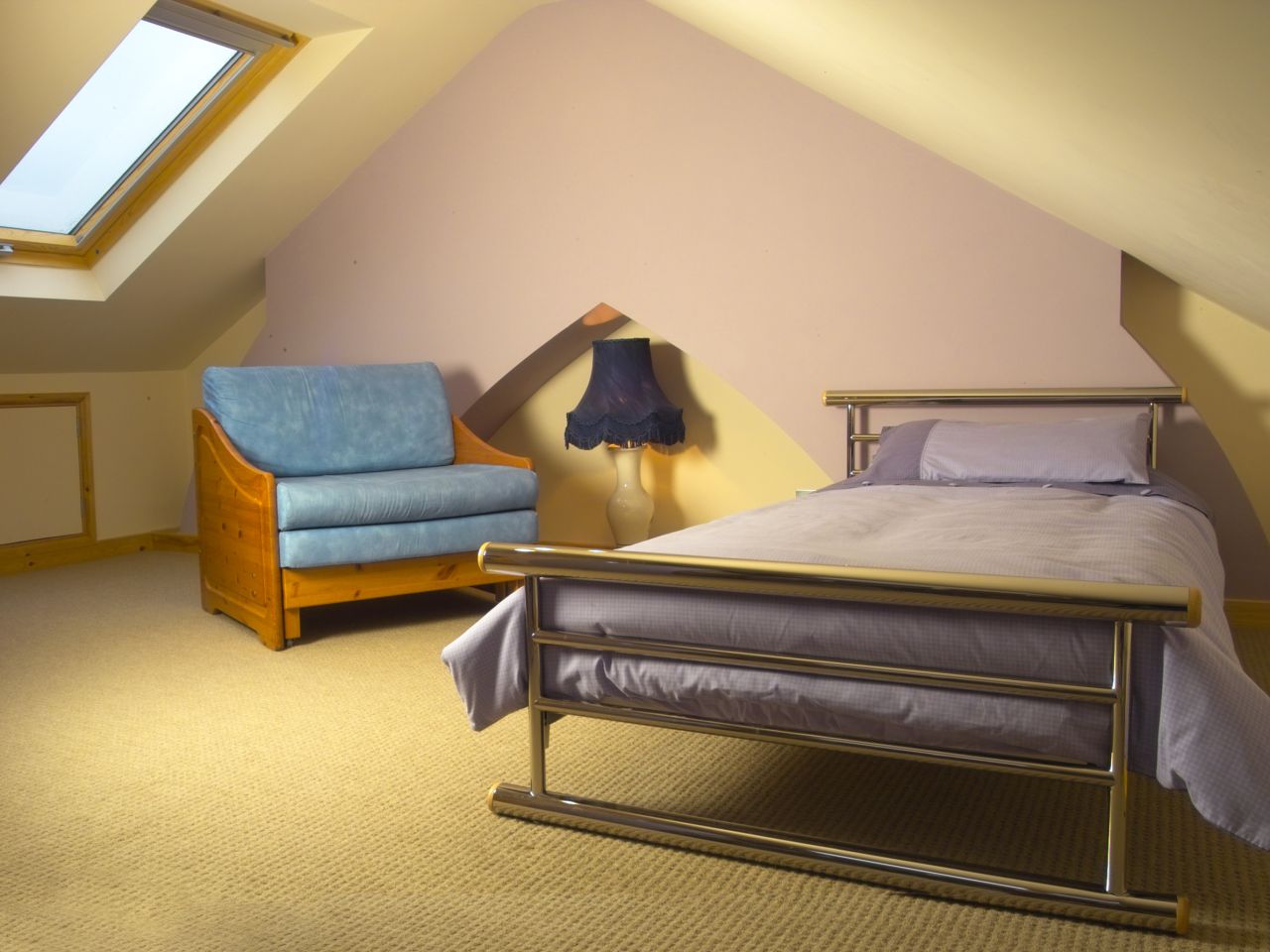
You probably know that warm colours advance (make the room feel smaller) and cool colours recede (make the space feel bigger). Ceilings don’t have to be white; if you want a cosy feel, paint the ceiling the same as the wall to lower it visually. All these tricks affect how a room feels so be aware of how your choices affect the visual impact of a space.
Painting skirtings, dado rails, picture rails and cornices
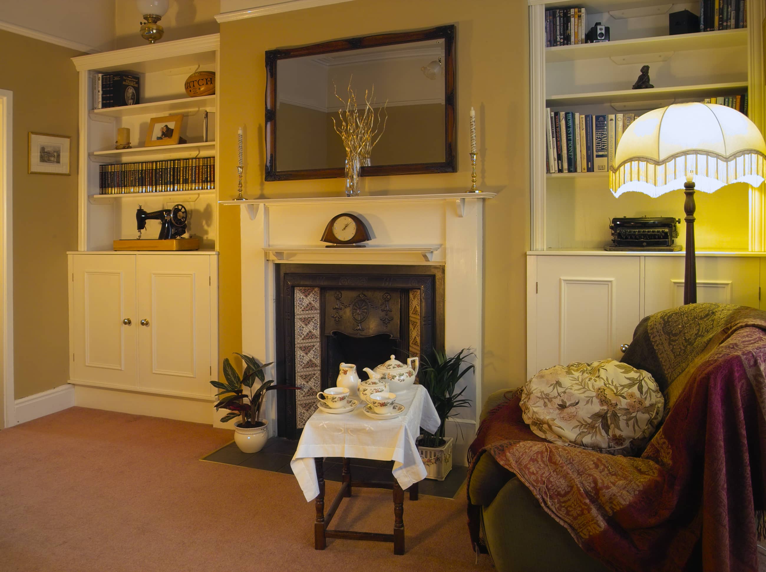
Because many older British houses have period features, don’t feel that you have to deal with them differently. You’re not obliged to paint them white. Remember that if you paint up to the picture rail in one colour and above the picture rail in another, this will shorten the room visually. If you paint it all one colour, the room will stretch up to the ceiling. You can make the room feel even taller by painting the skirting the same colour too.
Painting radiators
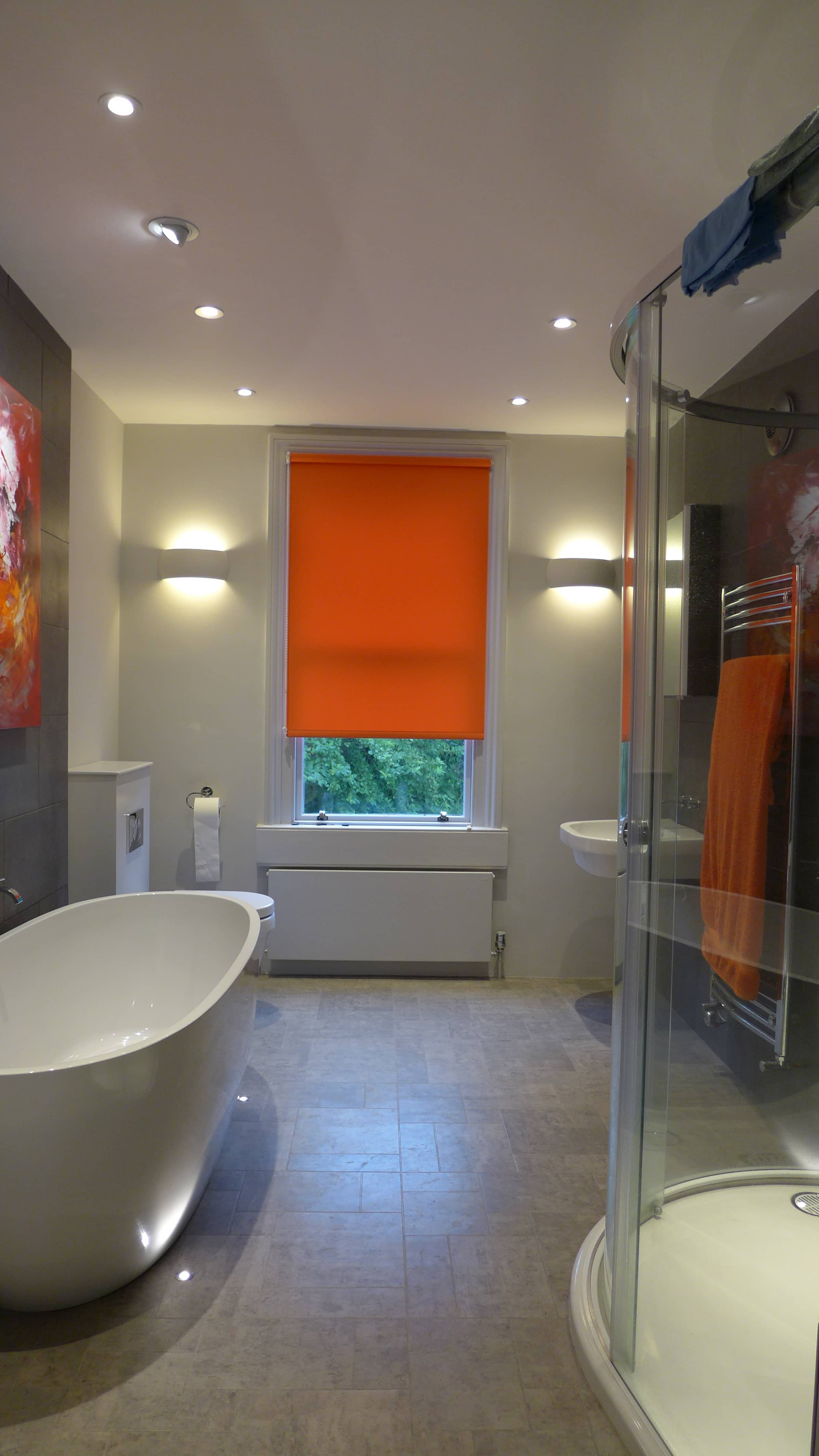
You can hide unattractive features by painting them to match the walls. We paint trade radiators and they really do “disappear”. You can use even emulsion for a quick job provided the radiators are cold at the time.
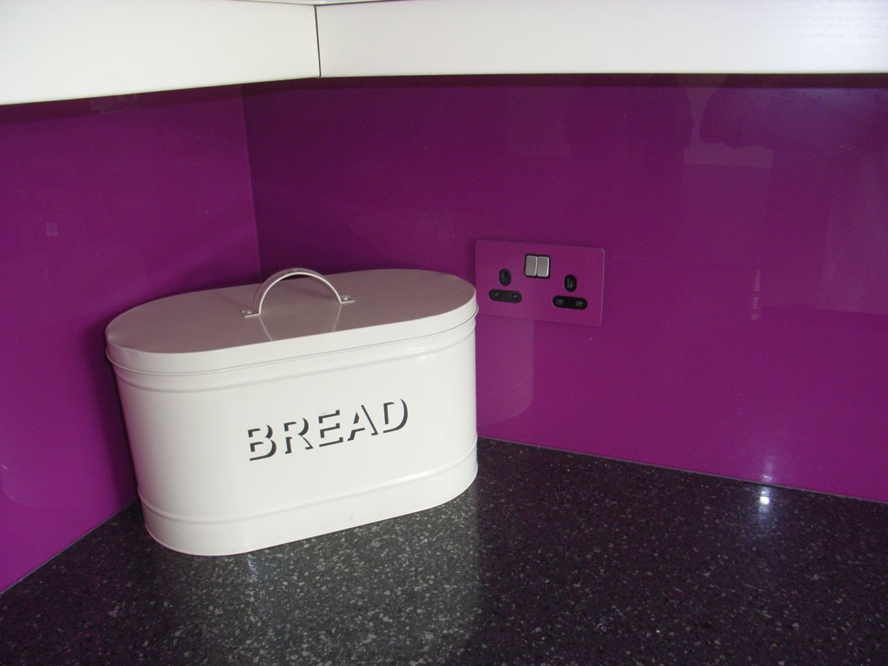
Sockets, switches and lights
We supply sockets and switches colour-matched to a distinctive wall where budgets permit. For neutral schemes, white plastic is perfectly fine – why draw attention to unattractive recessed ceiling lights by choosing chrome? It is the effect of the light that is important; not the light fitting itself.

Monochrome schemes
Monochrome decoration can be very dramatic and exciting, as with this stairway for a thirties’ property in Bristol.
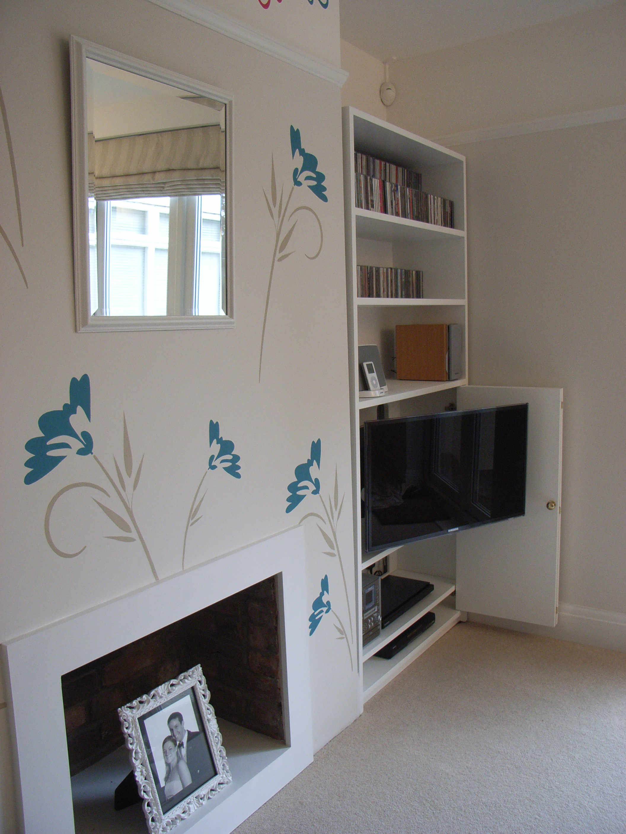
Feature Walls
With use this technique sparingly, and only when it works with the rest of the scheme. In a few projects, we’ve not found a suitable wallpaper, so we stencil a large mural design using colours that we are free to choose.
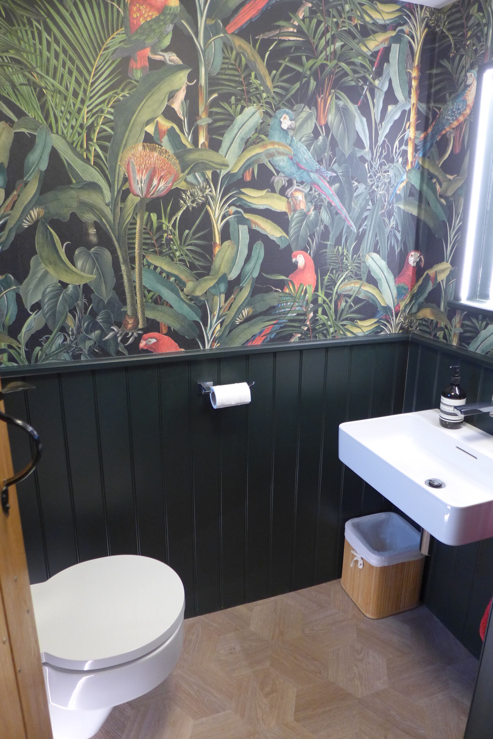
Wallpapers
We encourage our clients to be more adventurous with their decor. By and large, clients are conservative; unsure how far to move from their comfort zone. If that’s you, start with a low risk space like a cloakroom and see how you get on.
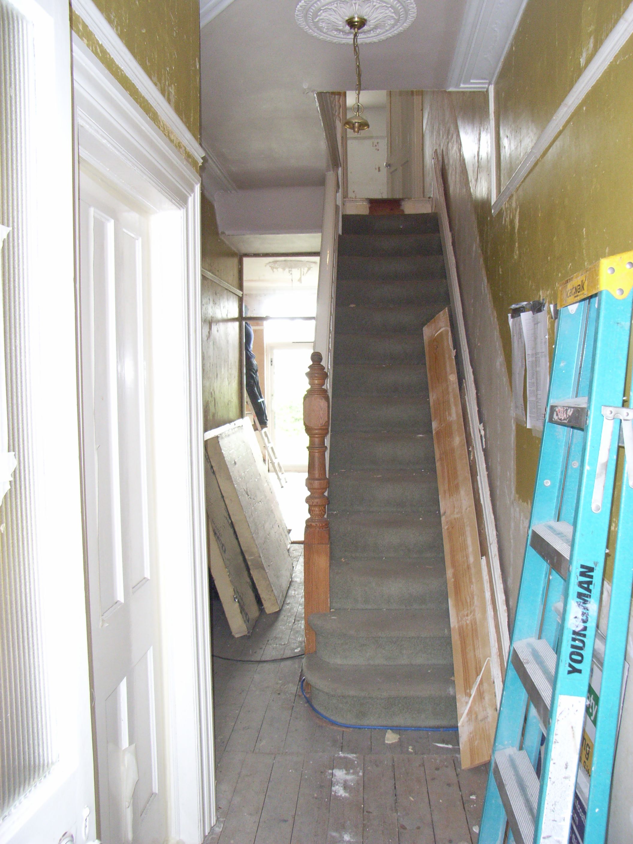
Decoration might seem like a straightforward job. Much of the time and cost is in preparation; if you want a top quality finish, you need to spend the hours filling and rubbing down walls, ceilings, architraves and skirtings.
If you’re looking to do up your home in Bath or Bristol and think we may be able to help, please look into our tailored interior design services.
